EDITORIAL
DAMAN Magazine Revamp
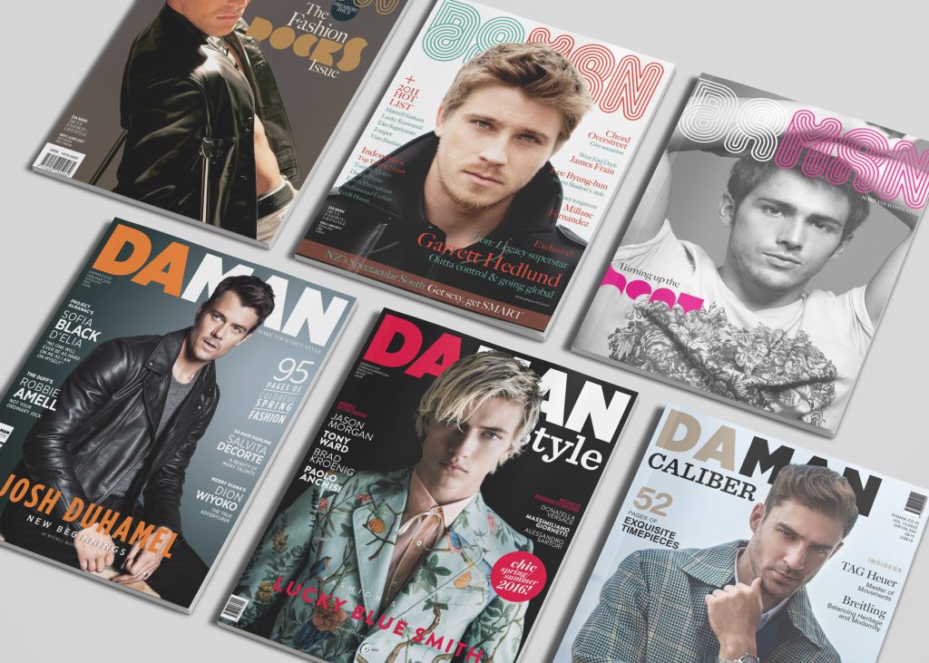
DAMAN Magazine previous design (upper side), after redesign DAMAN regular, DAMAN Style, and DAMAN Caliber (lower side)
STRATEGIC CASE STUDY
Context
DAMAN IS A PREMIUM men’s fashion and lifestyle magazine serving a high-end, style-conscious audience across Indonesia and international markets. As Indonesia’s only home-grown English-language men’s magazine, DAMAN occupies a unique position at the intersection of global culture and regional relevance.
As the brand matured, its visual identity no longer reflected its editorial ambition. Increased competition in the men’s lifestyle segment and shifting reader expectations called for a clearer, more confident design system that could scale across multiple editorial products.
Challenge
The existing visual identity lacked clarity and distinction. The logo was overly intricate and difficult to read at distance, often competing with cover imagery rather than supporting it. Inside the magazine, inconsistent typography, excessive cover blurbs, and an unfocused color palette weakened hierarchy and diluted DAMAN’s premium positioning.
The challenge was to redefine DAMAN’s visual language, enhancing legibility, strengthening brand recognition, and elevating perceived value, while maintaining flexibility across print, campaigns, and future brand extensions.
Objectives
- Redesign the DAMAN logo and establish a cohesive art direction
- Develop scalable editorial templates for three magazine titles
- Create a unified visual system adaptable to both editorial and marketing campaigns
- Support a full brand relaunch within a six-month timeline
Strategic Approach
The redesign began with audience, advertiser, and competitive research to align visual decisions with business and editorial goals. Insights from readers and luxury advertisers informed a direction that emphasized restraint, confidence, and clarity rather than visual noise.
A modular identity system was developed to allow variation without fragmentation. Typography became the primary brand anchor, supported by a disciplined color palette and flexible layout structures. This system ensured consistency across DAMAN, DAMAN Style, and DAMAN Caliber while allowing each title to express its own focus and tone.
Design Solution
The new logo system prioritized legibility and strength, pairing seamlessly with photography across multiple scales and formats. A refined typographic hierarchy, combining condensed sans-serif for impact and modern serif for long-form readability, created contrast and improved editorial flow.
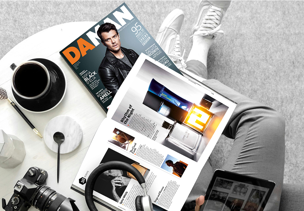
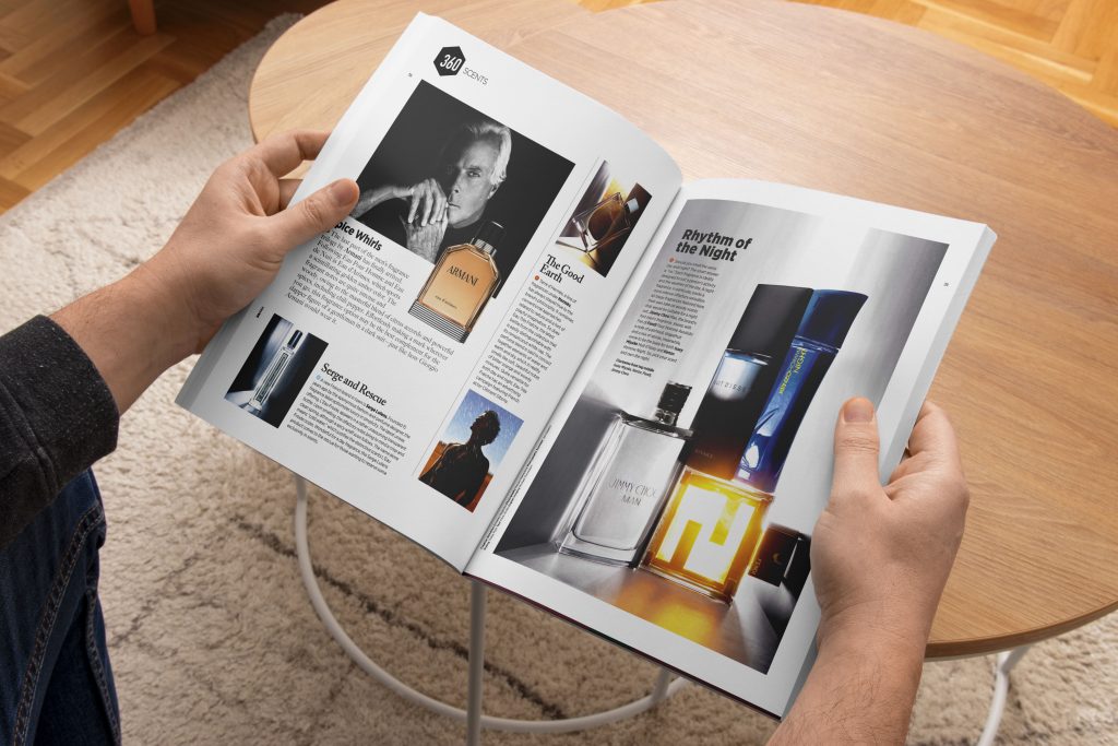
Layouts were intentionally differentiated by content type. Short-form and lifestyle sections embraced visual dynamism, while feature stories adopted cleaner compositions with generous white space and carefully curated imagery. Cover photography was elevated through international editorial shoots, reinforcing DAMAN’s global outlook and aspirational appeal.
Results
The relaunch positioned DAMAN as a confident, contemporary men’s magazine with a clear visual identity. The redesigned bimonthly title received strong endorsement from readers, advertisers, and stakeholders, and expanded its distribution to key international markets including Singapore, Hong Kong, Los Angeles, and New York.
DAMAN Style established itself as Indonesia’s first high-fashion men’s magazine, earning recognition from the global fashion industry and invitations to major fashion weeks. DAMAN Caliber quickly became a sought-after platform for luxury watch brands, with premium placements booked up to a year in advance and consistent invitations to leading international watch exhibitions.
Impact
The revamp transformed DAMAN from a visually crowded publication into a scalable editorial brand system. The new design strengthened market presence, improved advertiser confidence, and enabled the brand to grow across multiple verticals, demonstrating how strategic design can drive both cultural relevance and commercial success.
