KEY VISUALS
PON XXI 2024: Bersatu Kita Juara (Poster Series)
Overview
For the 21st National Sports Week (PON XXI) hosted jointly by Aceh and North Sumatra (Sumut), Letter Case was commissioned to design a series of high-energy promotional posters. The challenge was to create a cohesive visual language that celebrated both regional cultures while unifying them under the national theme, “Bersatu Kita Juara” (United We Win). Our goal was to blend traditional symbols with modern athletic dynamics to generate excitement and national pride.
Design Concept
The design philosophy hinges on “Cultural Kinesis.” We merged the explosive energy of modern sports photography with a sophisticated application of traditional Shape and Tenun Ulos patterns from both Aceh and North Sumatra. Instead of static backgrounds, these patterns were integrated dynamically into the negative space and typographical elements, creating a sense of movement and “cultural flow.”
“A dynamic poster, signage, ball plinth, billboard series that visualizes the unifying energy of PON XXI 2024. This campaign blends high-performance modern athletics with traditional Acehnese and North Sumatran motifs, creating a powerful cultural documentation under the theme ‘Bersatu Kita Juara.'”
Key Features:
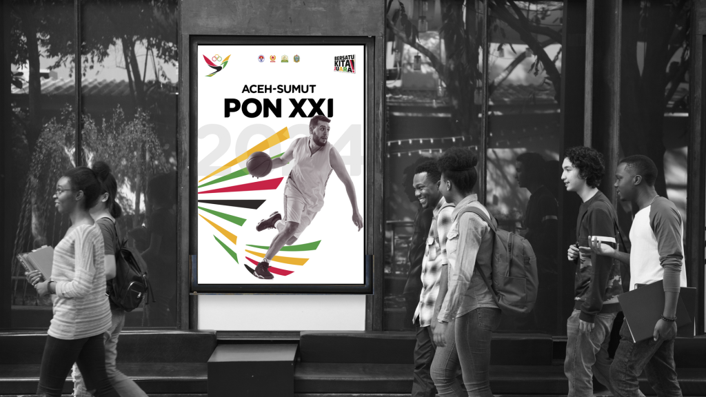
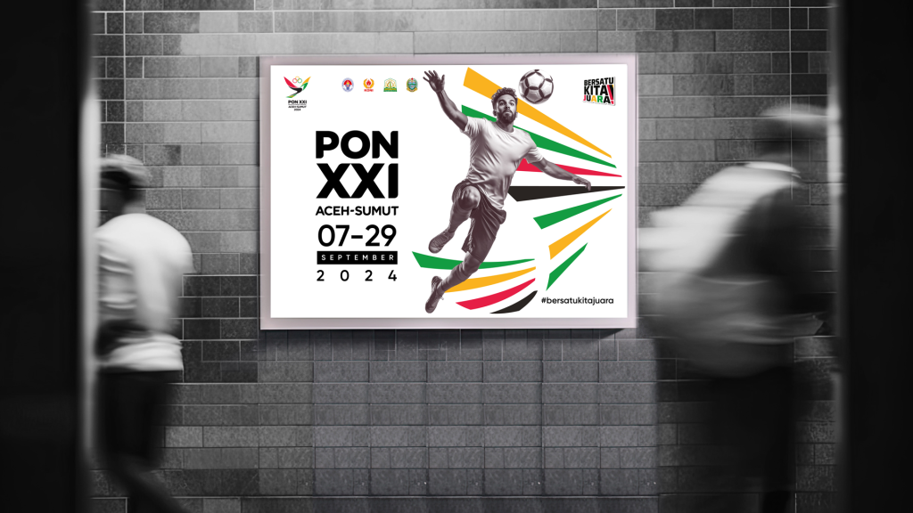
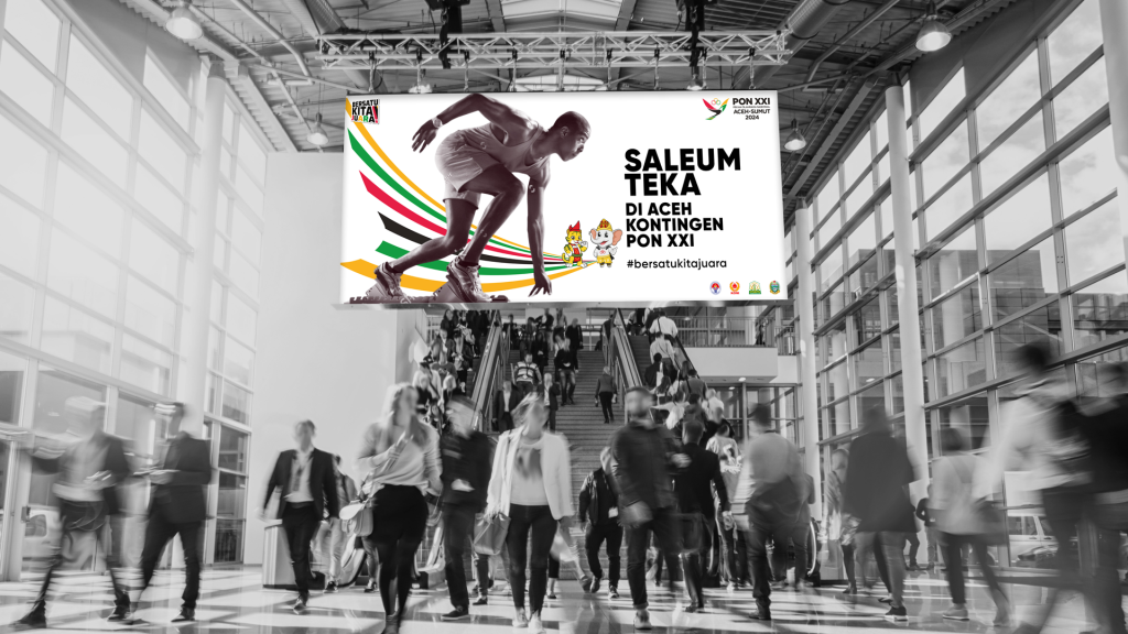
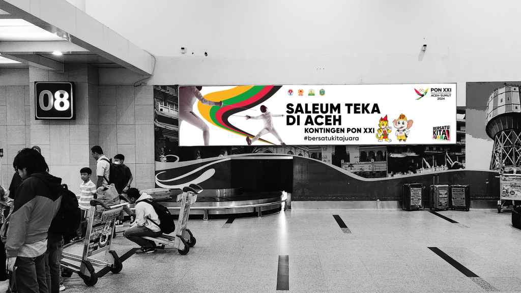
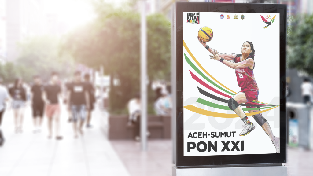
- Dynamic Athlete Duos: Each poster is built around a powerful composition featuring one/two athletes from different sporting disciplines (e.g., Fencing and Taekwondo, Running and Volleyball). This setup emphasizes the “Unity” theme and showcases the diverse events of PON XXI.
- Integrated Regional Motifs: Custom-designed patterns inspired by Acehnese shape and Ulos are layered into the typography of the event numbers and the background elements, creating a strong cultural anchor without sacrificing modern athletic energy.
- Bold “Impact” Typography: The event slogan and dates are rendered in an oversized, blocky sans-serif typeface, designed to break through visual noise and ensure readability from a distance. The numbers are often integrated into the action of the athletes.
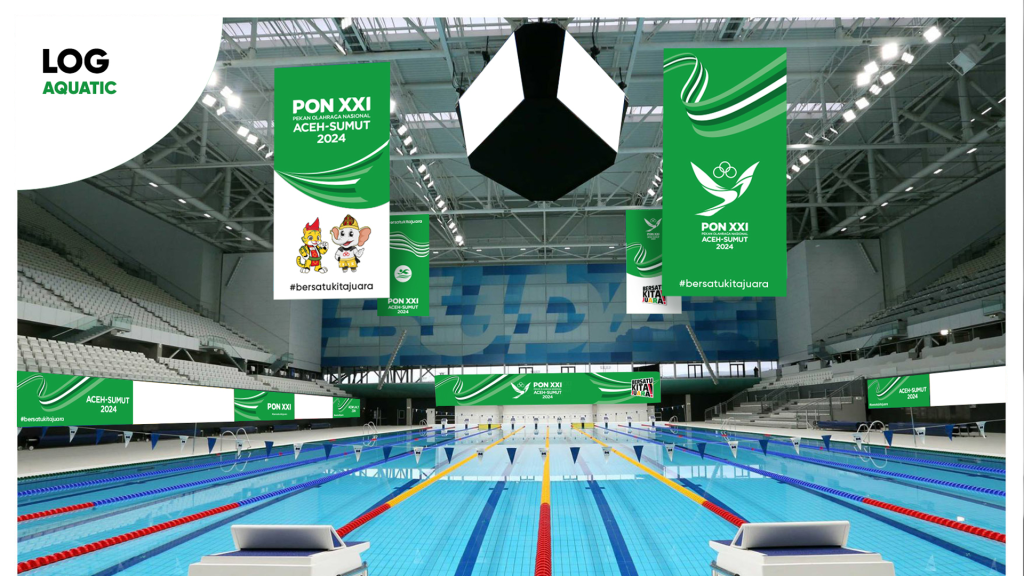
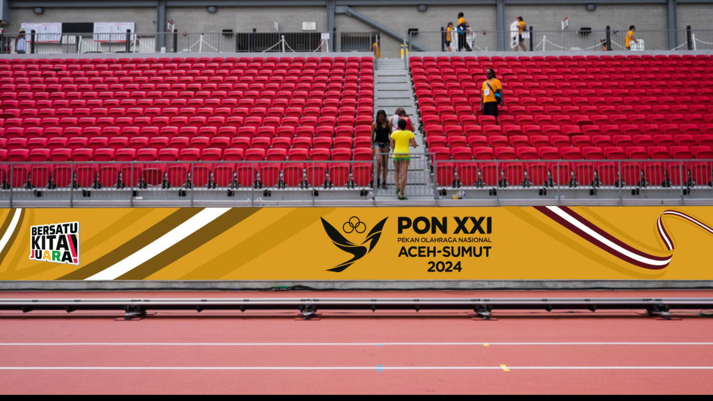
- Cohesive Dual-Site Branding: We ensured that the posters successfully balanced the unique identities of two separate hosts. By employing a shared palette of national red, white, and powerful green, we created a unified “event feel” rather than segmented regional outputs.
- Versatile Layouts: The posters are designed with clear grids that can be easily adapted from high-format vertical print to wide horizontal digital screens, ensuring brand consistency across billboards and social media feeds.
The Outcome
The resulting poster series successfully unified two separate regional identities into a single, cohesive brand for PON XXI. By blending high-performance athleticism with rich cultural patterns, Letter Case helped set a new benchmark for Indonesian sporting events marketing, creating a powerful, engaging documentation of a landmark national event.
Role: Art Direction / Layout & Typography / Pattern Design
Client: PON XXI 2024 (Aceh-Sumut Hosting Committee)
Format: Multi-Platform Integrated Campaign (Print & Digital)